Working to create coziness and comfort, every housewife would certainly like to create a unique image for her home. Fill it with a special atmosphere of coziness and comfort, individually suitable for your family.
Beige, green and brown colors in the living room interior
To choose the right environment you don’t have to blindly follow fashion trends, the main thing is to have your own taste and listen to your desires. After all, the perception of the world as a whole is quite an individual matter, what is good for one is bad for another.
White interior with pastel accents
A few tricks for working with colors
Dark colors:
- have the ability to hide any shortcomings
- optically reduce space
Bright hues:
- On the contrary, they visually expand the room
- Add freshness and comfort to the apartment
Multicolor tones:
- One color should always be dominant.
- In no case should colors overwhelm the decor in the house.
- Having chosen a certain color as a basis, add its own shades to it.
- Furniture should always be lighter or darker than the walls of the room.
- Do not decorate the ceiling and flooring with the same color, otherwise the room will look unbalanced, and this in turn will create a feeling of discomfort.
Turquoise accents in the room
Combination of colors in the interior - table: floor, ceiling, walls, furniture
When creating an interior, it is very important to choose the right floor color - this detail will certainly play its role. A competent combination of colors in the interior - the table “floor, ceiling, walls, furniture” will help achieve the desired effect, from stretching to expanding the space. You don’t have to guess, since the laws of color combinations were developed long ago by design experts. To bring harmony to the interior of your apartment or house, just use their advice.
Laws and color choice
The color range of doors and flooring is somewhat limited compared to wall decoration, painting and wallpaper. But, nevertheless, when you come to the store, you will be able to see a fairly wide range of shades of parquet boards, laminate, tiles, baseboards and linoleum.
Important! The first thing you need to determine is what kind of flooring you need. All options are appropriate and good if used for a suitable design and room.
What effect does the floor shade create?
- The light shade is a great space enhancer and light reflector. In addition, it gives the space a fresh feeling when combined with a light shade on the walls. However, if you combine cold-colored wallpaper with light-colored floors, you may end up with an uncomfortable atmosphere. This applies especially to the northwestern location of rooms.
- A dark shade is a bright contrast, style and stability, provided it is diluted with light wallpaper for the walls, decorative elements and furnishings. Whereas the use of contrasting accessories to match the floor covering against a lighter overall background looks very harmonious. However, this solution is suitable only for rooms that receive a lot of sunlight.
There are many convenient special online applications, tables of color combinations in the interior, which take into account the floor, ceiling, walls, furniture, which will help you more correctly select the color combination of the floor to the wallpaper and other finishing details in the apartment.
Important! One of the fashionable techniques today is the play of contrasts, when a white floor is combined with almost black furniture, and vice versa. The same goes for doors that contrast with the floor. Such techniques will negate the possible excess of white and the heaviness of black.
Walls, ceiling and floor - modeling the space
It's no secret that with the help of colors you can change and transform the perception of space beyond recognition. Depending on your goals, you can choose the shade that will hide imperfections and highlight all the advantages of the room.
The effect of combining different colors:
- The light color of the ceilings, walls and floors will make the room spacious and airy. However, the main thing here is not to overdo it, otherwise you can end up with a pale and cold room.
Important! An option to break up the monotony is to cover one of the walls with bright wallpaper.
- Pastel-colored walls, a light ceiling and a dark floor also give the effect of increased space, but without impersonality.
- A light ceiling and floor in combination with dark walls horizontally stretch the room, making it lower. This effect is especially pronounced when there is one bright side or a large window.
- The dark shade of the walls and floors combined with the white ceiling creates a basement effect.
Important! Of course, neither “white infinity” nor “basement” are desirable for any room, especially in the bedroom or kitchen. But an overly snow-white living room can be saved with the help of dark doors and an expressive baseboard, for example, by bringing it down “from heaven to earth.”
Three players - doors, furniture and floor
How to choose the right color for the floor and baseboard if you already have furniture? How to choose doors - a contrasting shade with the floor or one tone? These are valid questions because these finishing touches in your home or apartment are not expected to be replaced for many years.
Color of floors and furniture
The first rule for this pair is obvious - the floor should be at least two shades lighter than the furnishings or noticeably darker. Otherwise, your sofas, cabinets, chairs will simply “disappear” against the background of the floor of the same color.
Important! By placing a contrasting rug on the floor, you will solve the problem of the same tone of furniture.
The best combinations of furniture and flooring:
- White-grayish flooring - dark furniture, for example, wenge or pure white.
- Light warm wood floor colors - white, chocolate furniture. It is appropriate to use gray in furniture due to the contrast of the cold shade and the warm floor.
- Walnut flooring - pastel colors from delicate peach to white and cream. Details from soft, bright furniture, but in warm colors, are not excluded. Cold ones need to be dosed so as not to get an overly strict atmosphere.
Some design experts choose black furniture to complement the dark floor covering, following fashion trends, however, this gives the room a gloomy look. When placing accents, it is worth remembering that no whiter than three primary colors should be used in the room.
Important! Much depends on the place you are decorating - the bedroom cannot be a place of bright contrasts, while in the kitchen and living room you can use more daring experiments.
Color of floors and doors
There are only two directions in the combination of flooring and doors:
- In one color.
- Bright contrast.
One color
When implementing the first option, when the floor and doors are made in the same color scheme, it is much better for the door to be a couple of tones lighter. This will make it possible to logically perceive the space from top to bottom - from a light ceiling to a floor of a darker color.
Contrasts
If the flooring and doors are white, then the room needs contrasts in the form of some rich accessories, furniture or walls. At the same time, the baseboards should not be white, otherwise you will end up with a shapeless space.
And vice versa - a dark floor, doors are appropriate only where the walls are pastel colors. However, if we are talking about a small room, for example, a kitchen or bedroom, then it is better to refuse a dark door in combination with a dark floor. One dark door will be enough, and a bright accent will be provided.
Important! Today, one of the fashionable trends is the combination of dark flooring with light walls, wenge-colored doors, and selecting similar dark baseboards.
Many people do not attach much importance to the plinth, but it helps to effectively outline the available space, playing on contrasts. Moreover, there are baguettes (plinths for ceilings), which can also have a color other than white. By using such skirting boards, you will see how much more interesting any room in the apartment will become.
Video material
As you can see, there are plenty of opportunities. There are no strict canons or rigid rules here, only recommendations from designers, and therefore choosing a floor color is quite simple. By following the advice, you will not make a mistake with your choice and will be able to create a harmonious and, at the same time, original interior design.
Share on social media networks:
serviceyard.net
Basic colors. Basic rules for combining them
Black is a fairly universal color that goes well with all other tones. But the closest allies, besides white and red, are green, yellow and orange.
Red is an activating and stimulating color; in addition to contrasting white and black, it looks great with yellow, green and gray.
Yellow is a color that tones and strengthens the nervous system; it feels comfortable with blue, lilac and blue.
Green is the color of freshness and inspiration; in addition to the above combination, it looks great against the background of golden brown, light beige and a calm dark shade of yellow.
Blue is the color of the deep, bottomless ocean or sky, increasing concentration. It harmonizes wonderfully with rich yellow, lilac and steel.
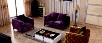
Purple and white bedroom
Adjusting a room using wall color
Using the right wall color, you can visually manipulate the architecture of the room: expand and narrow the dimensions of the room, optically make the ceilings higher or lower, and also, if necessary, highlight functional areas.
Cream and blue living room
Correctly chosen tones will help correct wall imperfections in the form of cracks, surface unevenness or stains. For this occasion, you will need paints in soft, desaturated tones. But at the same time, take into account the intensity and amount of sunlight entering the room.
Rooms facing north should use light colors, while rooms with windows facing south or east should use intense shades.
Not only the walls, but also the floor and ceiling, as well as the furniture, should be in harmony with each other for a harmonious combination of the color palette in the future interior.
The right combination of ceiling color and wallpaper on the wall
A successful combination of shades creates a comfortable atmosphere. The walls and ceiling determine the features of the composition. Their color is selected according to special principles, and the choice depends on the idea. Initially, wallpaper is selected, and only then the correct choice of the nature of the ceiling finish is formed. Photos of some unique approaches are reflected on our website.
What determines the choice?
The right color is, first of all, a successful combination of shades. Using their combinations, rooms are visually enlarged or reduced. When decorating small rooms, light colors are used; for large ones, dark, cold colors are used. The primary colors are yellow, blue and red.
Other shades are obtained by mixing the main ones, so they are auxiliary. The wallpaper is chosen so that the walls do not stand out from the overall composition, so the right approach is to choose a color that is similar to the ceiling.
With the help of white, the degree of saturation is regulated; in itself it is not expressive, so there should not be too much of it. Small interior items are made in light colors.
A black ceiling and gray wallpaper will make the walls visually shorter. The combination of these shades is relevant for rooms with very high ceilings. If you choose the right tones, the picture will become soft and expressive. The main goal is comfort and warmth? Brown is what you need. It is mainly used in furniture design.
We must remember that walls and furniture also need to be successfully combined. If the furniture is light and the wallpaper is dark, then the furniture will appear larger. And vice versa.
How to combine shades?
Often the ceiling is painted in light colors, while the wallpaper is chosen bright, but also light. Large furniture should be darker, this creates a good contrast. Such a composition will be restrained, but it will eliminate dullness and monotony.
Today, more complex techniques for combining tones are practiced. The ceiling is the basis from which we start first. It is its height that defines the idea. In some cases, designers choose a contrasting solution, then the combination is formed from shades that, if used incorrectly, create dissonance.
Original approach
In pursuit of originality, it is easy to create visual noise, so experts will help in this matter. The ceiling can be painted lemon yellow, and the wallpaper can be blue, green or even lilac. Although the color of the walls in some cases is chosen varied. For example, three walls are golden, and one is terracotta.
The ceiling can also be diversified, but mostly it is made in a single color. Photos of some original approaches can be viewed on this page. It is very important to take into account not only the color of the wallpaper, but also some interior items, for example, carpets. It is important that they are in harmony with the chosen palette.
The ceiling in children's rooms is painted in warm colors, but older people better perceive cool, calm colors - gray, blue, etc. For young people it is better to create a contrast. To understand the features of the design approach, you should look at the photo.
Is it really that simple?
You can create a picture of the interior yourself, the main thing is to take into account what the ceiling, walls and furniture will be like. If you do not plan to implement unique ideas, then you can always use standard techniques. The furniture is selected to match the interior, and the ceiling should be successfully combined with the wallpaper and floor. In case of difficulty, issues related to design can be resolved with specialists.
ceilingspro.ru
Trial painting of walls
The choice of wall color is much more important than the arrangement of furniture and decor in the room. But on the other hand, the color of the walls can be easily changed at any time, but furniture is bought for more than one year. Every housewife wants her favorite kitchen set to please the eye for as long as possible.
The same paint color will look different on different surfaces:
- on a surface with a smooth texture, the paint looks lighter;
- on a rough surface - on the contrary, darker;
- on matte – the color will appear warmer;
- on polished - colder.
If you doubt the result and want to make sure the chosen shade is correct, paint a small area of the wall as a test.
Turquoise and orange accent in the dining room
Wall color
If the color of the walls becomes boring, then you can easily repaint it in any other color. If you are tired of the walls of a single color, paint one of them with paint of the opposite contrasting color. A contrasting technique will require a minimum of time and money from you, and your interior will look completely different. And if you get bored with the color again, you can easily change it again.
By the way, painting one of the walls in a way that is different from the rest is currently quite a fashionable trend in the interior.
Green walls in the room
White color
A universal color that creates a feeling of spaciousness, but sterile cleanliness can be associated with hospital walls, which in addition to boredom will also add unpleasant sensations. Harmonizes with almost any shade. This is its main advantage over the others. But still, it goes best with blue, red and black. That is, if until now white has predominated in your home, if desired, it can be diluted with all the colors of the rainbow.
White walls and furniture in the interior
White walls and furniture in the living room
Pink color
By skillfully using paints you can not only give a new breath to an old interior, but also easily simulate the architecture of the room. With the help of one bright wall, it is possible to divide an elongated room into 2 functional zones.
Pink accents in the living room
Don’t be afraid to dilute a large room in which light colors predominate with rich, bright colors. This combination will only add chic and superiority to the room.
Flooring in beige or cream tones and light furnishings will be wonderfully diluted by a pink or fuchsia wall.
Pink bedroom
Ceiling color - photo review of unusual options for bright design combinations
Contents
When we were planning to do renovations before, we didn’t think about the color of the ceiling; it was always white.
With the advent of new technologies, you can choose colors that match the interior.
First you need to choose a finishing method, then possible color solutions.
Color and psychology
When choosing a color, it is necessary to take into account the psychological perception of the family, so that the coating does not become a source of irritation and depression.
White color harmonizes well with all tones; it is a symbol of purity, youth and freshness, especially necessary when decorating in dark colors. In combination with light walls, a suspended ceiling can be associated with a hospital, and in a nursery it will add austerity.
Cool tones of ceilings - blue-blue or purple colors. By choosing light shades, we will visually expand the space and the ceiling will become higher. The blue color is very relaxing, so it is ideal for the bathroom (swimming pool), but not acceptable in the work area.
A light purple shade of the ceiling is best chosen for living rooms to stimulate vital energy and develop creative potential.
Blue is ideal for a bedroom or nursery, it gives peace and tranquility.
Brown tone is often used for cabinets; it gives stability. It is not used for a residential building due to its association with old age.
To activate the brain, you need to choose the yellow-orange-red spectrum and green color. They are perfect for the kitchen, children's and work rooms.
- Yellow is the color of joy, smiles and happiness.
- Orange gives optimism, an antidepressant.
- Green – growth, learning new things, harmony.
- Pink – tenderness, relaxation.
- Red gives excitement and stimulation.
Color selection
There are rules for choosing the color of the ceiling.
For low ceilings, you need a light tone and a dark floor, and for high ceilings, vice versa.
If the windows face north or are in the shade, you need warm yellow-orange ceilings.
If you need to hide from the sun, turquoise or light green shades are good for ceilings.
It is recommended to paint vaulted ceilings in bright colors: green, and for the living room lilac or purple.
Ceilings in various rooms
For hallways, it is better to use white, sky or beige colors to make it seem more spacious. A small drawing is possible.
Ideal for the bathroom: blue, light green, white and turquoise shades.
Kitchen
Here you can show your imagination. If you need to reduce your appetite, then you need to choose blue, blue and light green. For those who don’t need restrictions, the yellow-orange color scheme is suitable.
If you have children, you should not make the ceiling multi-colored so that the baby is not distracted from eating.
Living room
The ceiling should be in harmony with the surrounding interior. So for the rest room, in addition to white, pastel colors, blue-blue or lilac colors are recommended. They will both calm and develop creativity.
Bedrooms
Designers recommend colored ceilings for the bedroom, but they are rare. For a good rest, it is better to choose solid colors or with a small, rare pattern. Pale pink, milky or beige colors look good.
At high altitudes, you need to choose dark colors. A fantastic option for the bedroom would be “Starry Sky”, where there is azure blue with bright stars (constellations). This will add mystery to the whole room and will have a beneficial effect on the psyche, inducing dreams and sleep.
Children's
It is better to design the nursery taking into account the child’s psychology. Light colors are better for the ceiling: sky, beige or white. You can add a delicate pattern.
A restless child needs calming light colors. A blue stretch ceiling with spectacular constellations and LED lighting will quickly calm your baby. To relieve boredom, you can decorate with accessories: lamps, hanging parts.
The right shade of the ceiling will highlight the advantages of your style and relieve tension or stress after work.
Seamless ceiling - (45 photos) How to choose a ceiling - review with photo examples. Ceiling in the bathroom - 50 photos Ceiling in the kitchen: (60 photos of new products) Curly ceilings - (80 photos) 3D ceilings - photo review of types
Photo examples of beautifully designed ceiling colors
You can also watch several useful videos about the color of ceilings:
Also look here for related articles:
alldesigngroup.ru
Orange color
Thanks to the same intensity of colors, color harmony is easily achieved. Knowing some tricks will help you skillfully not only combine colors, but also organize the space.
Orange furniture in the living room
An orange wall optically brings the distant part of the room closer, which visually makes an overly wide room more comfortable.
The rich orange color of the wall looks great in conjunction with a green floor, carpet or flooring. It would not hurt to add decorated elements in white, cream or yellow-green shades to this composition.
Orange, white and black colors in the kitchen
How to combine the color of walls, floor and ceiling
The color scheme of a room is very important when creating a comfortable space. And there are many clever tricks for breathing light and air into a small room, and making a spacious one with too high ceilings more comfortable and warmer.
Let's look at several options for color design of a living room that may be useful to many of you during your next renovation.
Contrasting combinations
bright walls, light ceiling, dark floor
A room that uses contrasting colors always looks stylish and catchy. In addition, by combining frankly light shades with richly dark tones, you can greatly correct shortcomings or emphasize the advantages of a room.
2
- For rooms with low ceilings
Use a thick and dark shade for the walls, for example, in the form of wallpaper with a vertical ornament or pattern. You can do without a cornice or choose a thin ceiling cornice, no more than 5 cm wide to match the walls. The ceiling should remain light, and the floor, on the contrary, dark. Thanks to the even, rich color and verticals, the walls seem to “stretch out”, and the weightless ceiling against their background seems to float. The choice of a dark floor is not accidental, since it is it that creates the depth of space.
- For narrow rooms with low ceilings
Using all the same techniques as in the first option, but complementing them with a contrasting light color of one of the walls, you can visually shorten an overly long room. You can also decorate the window (if there is one on the far wall) with light floor-length curtains using a ceiling cornice. Thus, two problems are solved at once: the room seems taller and visually less elongated.
Advice
In a room with dark walls and floors, it is better to use light-colored furniture, and accessories can be bright. Such techniques will add the necessary volume to a small room. And if you want to visually “spread” the walls a little, then install the carpet, sofa or bed across.
4
41
Current gradient
light ceiling, darker walls, dark floor
The living room, bedroom and any other room that uses different shades of the same color scheme looks harmonious and very traditional. If you are a fan of a measured lifestyle and you like the classics more than other styles, you can choose, for example, the color of dark chocolate for the floor, cocoa for the walls, and cream for the ceiling.
Stretching from dark to light brings harmony and peace. This combination is designed to balance and correctly distribute the load of all horizontal and vertical planes. To this it should be added that this combination of colors of walls, floors and ceilings is perfect for rooms of any type.
The selected range can be supplemented with white or dark brown and black on skirting boards, doors, trim and cornices, depending on the task. Colors and shades for furniture and accessories are chosen at your discretion, but based on the thermal saturation of the walls, floor and ceiling.
62
3
Light and air
light ceiling, light walls, dark floor
If you have chosen dark parquet or laminate for a small room with low ceilings, there is no need to be afraid that the color of the floor will steal precious centimeters of height. We recommend that you correct the situation by simply using only light transparent shades for all walls and ceilings and curtains. Platbands, cornices and skirting boards should also be used in white or the most suitable light tone.
Advice
We do not recommend cluttering the already heavy-toned floor with a large amount of furniture with rich texture and color of the upholstery. Use only necessary items with laconic shapes and graceful lines. You can lay a light light rug on the floor, which will visually distract from the dark floor.
152
Opposites Attract
dark ceiling, light walls, dark floor light ceiling, dark walls, light floor
Oddly enough, but this color scheme can be suitable for rooms with both high and low ceilings. The whole point is that the single shade of the walls should be invariably light or dark, and, accordingly, the floor and ceiling should be of the opposite tone to the walls.
- For rooms with high ceilings
To visually reduce the height of the room, choose dark colors for the floors and ceilings. And remember that a cold shade has the ability to distance, and a warm shade, on the contrary, has the ability to bring objects and surfaces closer.
11
- For rooms with low ceilings
In order to apply this method, you will need to construct two levels of ceiling above your head. The point is to paint the first (basic) level in a dark, cool shade, and make the second (suspended) level light. This technique will visually lift and deepen a low ceiling. Light walls will expand the space, and a dark floor will balance the load of the top of the room.
14
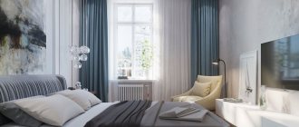
Blue
The color of peace and relaxation, because the cold tones of blue and gray act as a sedative for the nervous system, balance feelings and thoughts, and even induce sleep as a sleeping pill.
White and blue bedroom
Ideal for spacious rooms with large windows. Try painting the wall at the head of the room where the household members sleep in a rich blue color; it will go well with the shades of gray and blue that can be used to paint the rest of the walls and floor.
Blue, white and brown colors in the bedroom
How do colors combine in the interior?
The general combination of colors is presented in the tables above; now it’s time to talk about the most popular colors and how to combine them correctly in the interior.
Important! White color goes perfectly with any color, so it can be safely woven into any interior color scheme.
What color goes with gray?
Gray color has a rich hue. Many people mistakenly consider it faded and boring, because in the photo below you can see how noble the interior looks in gray, especially in combination with splashes of bright colors.
So what color goes with gray in the interior? The answer is simple - any, but the most commonly used colors are:
- Blue
- Pink
- Brown and beige
- Yellow
- Red
- Black
- Blue
- Lilac
The versatility of gray and its many shades makes it possible to implement any bright and creative design idea. Moreover, gray color slightly mutes bright and acidic colors, so with the help of this color you can easily correct a room that is too colorful. More photos of gray in the interior.
What color goes with brown in the interior?
The brown color in the interior must be diluted with lighter shades so as not to create a feeling of gloom. Brown with its beautiful shades (cinnamon, chocolate, coffee, caramel, camel) looks very noble and adds warmth and comfort to the room, symbolizing reliability, devotion and stability.
The main colors that harmonize with brown are the following:
- Golden
- Grey
- Pink
- Yellow
- Beige
- Burgundy and red
- Mint and pastel blue
More photos of brown in the interior.
What color goes with beige in the interior?
Beige color is both a cold and warm shade, which is why it owes its versatility. This color acquired cold notes from white, and warm notes from golden brown. This light color makes the interior light and calm, adding home comfort due to the naturalness of the shade.
So what color goes with beige? Beige goes well with many shades, among which are the following:
- Brown with all its shades
- Gold and bronze
- Yellow
- Pastel and bright blue
- Green and olive
- Lilac
- Red
- Turquoise and mint
More photos of beige in the interior.
What color goes with peach in the interior?
Peach color is a soft and delicate combination of yellow and pink shades. This color gives the room coziness, warmth, peace and security. The rich color of peach brings a festive mood to the home, while muted and pastel peach is calming and peaceful.
You can make the interior colder by combining pale peach with light pink shades, and peach and orange will make the room warmer. The following colors can be called the most suitable for peach in the interior:
- Brown with all its warm and cool shades
- Beige and yellow
- Pink
- Orange
- Turquoise and mint
- Blue and cyan
- Purple and lilac
- Green
What color goes with orange in the interior?
Orange color is one of the brightest and warmest colors in the interior. Even when combining it with other colors, it will not lose its richness and warmth. Orange color energizes and invigorates perfectly, so the ideal option would be to design the kitchen in orange tones, because every cheerful morning begins with this room.
The most successful combination of orange is its combination with white. This combination will be the sunniest and most energetic; moreover, this color scheme will help expand the room, which is beneficial for the kitchen and bathroom.
Advice! Orange color can be used to highlight some small decorative items. For example, you can put an orange ottoman, which will make the room look brighter and more cheerful.
The following shades go well with the radiant orange color in the interior:
- Grey
- Brown with all its shades
- White
- Red and cherry
- Blue and pastel blue
- Delicate shades of green
- Yellow
- Mint and turquoise
More photos of orange in the interior.
Do not confuse orange with terracotta, which is a mixture of red and brown in different concentrations. Terra, which is a calmer and more comfortable color, is more difficult to combine. If you still decide to contact him, then forget about artificial chemical colors and pay attention to more natural ones, the same applies to the furnishing of the room; terracotta color goes well with folk styles. Colors that will suit you: calm green or light green, lilac, blue, blue, all shades of red and brown, coffee colors (coffee with milk, cappuccino).
What color goes with purple in the interior?
Violet is a cool color of wisdom and calmness, which has light mystical notes. Scientists have also proven that the color purple has the ability to calm and pacify.
The color purple has many shades, the most popular of which are mystical dark purple, natural lavender and delicate lilac.
Purple color gives the room a noble and luxurious look, combining well with the following colors:
- White
- Gold
- Black
- Red
- Turquoise and mint
- Crimson
- Blue and cyan
- Beige and orange
- Natural yellow (egg yolk color)
- Light green
Photo of purple in the interior:
What color goes with green in the interior?
Green color suits absolutely any room and symbolizes peace. All warm and cold shades of green bring with them a good mood, a feeling of comfort and tranquility.
Green is a rich color and that is why it is considered the most difficult color to combine.
The best solution would be to combine the shades of cheerful green themselves. For example, pistachio and lime can be added to the main emerald color, which will dilute the cold color of the gemstone.
The following colors are considered the most suitable for green:
- White
- Black and brown
- Yellow
- Orange
- Gold and bronze
- Red and burgundy
- Blue and cyan
- Turquoise and mint
- Grey
Photo of green in the interior:
What color goes with lilac in the interior?
The lilac color is distinguished by its colossal tenderness and lightness and most often appeals to delicate and creative people. With the help of lilac, you can create a mysterious and mystical interior in cold colors. Such an environment is very relaxing and puts the mind into some kind of trance, which is why many avoid this color.
Most often, lilac is used in pastel colors, which look impressively delicate, as can be seen in the photo below. So the most suitable lilac colors include the following:
- Gray and silver
- White
- Black and brown
- Beige and yellow
- Golden and carrot
- Blue and sky blue
- Turquoise and mint
- Dark purple
- Fuchsia
- Delicate shades of green
What color goes with blue in the interior?
Blue color is used to create a delicate, light and airy interior in cool colors. Even in combination with warm colors, a room in blue will not lose its cool note and freshness.
The combination of blue and white is very popular. This combination perfectly expands the space and makes the room unusually light and delicate. Most often this color is used in bathrooms.
Advice! In order not to lose the lightness and airiness of the blue and white combination, you should not add accenting bright colors, especially warm ones.
The following colors can be called harmonious with blue:
- White
- Yellow brown and beige
- green and turquoise
- Blue and mint
- Orange
- Raspberry and lilac
- Pink
Watch the video
This video lesson will show you how to correctly combine colors in the interior.
Spicy color
To create an interior in an oriental style, use the bright, rich colors of oriental herbs and spices. Soft shades of cardamom, turmeric and cinnamon will help recreate an interior reminiscent of the design style of North African homes. The palette of spice shades goes well with other delicate tones.
Spicy colors in an oriental interior
Beautiful combination of spicy and blue colors in the interior
Choosing the color of suspended ceilings and wallpaper - little tricks
What is the choice of color for suspended ceilings and wallpaper and little tricks? Many buyers, tired of wondering if they will make a mistake in matching the color of suspended ceilings to the wallpaper, install traditional white ceilings. But there are little tricks that help you choose the right combination of ceiling colors and wallpaper in your interior. Let's take a closer look.
- It goes well with any interior style, not only white, but also other uniform colors. For example, different ceiling colors - black or gray. At the same time, gray color looks much more original than white and is not as strict as black. Choose the shade of gray you like from the wide palette available. If the wallpaper is silver or marbled, the gray ceiling will have a blue tint, which looks very beautiful.
- Even beautiful stretch ceilings will look boring against the background of wallpaper of the same color scheme. This is especially true for glossy ceilings that reflect color. But even matte stretch ceilings absorb some of the colors of the wallpaper. Therefore, it is better to choose a color combination of ceiling wallpaper in combination with interior accents (for example, with photo wallpaper covering only one wall of the room). The correct solution would also be to combine the color of the wallpaper and the ceiling in this way: matching the ceilings to the curtains, upholstery or its elements: handles, doors, patterns. Thus, a holistic interior design is created. And in order to find out how to design the facade of buildings, we recommend reading the article “Facade design - house facades, building facades” - everything is described there in detail.
- The golden color in artistic wallpaper, for example, goes perfectly with the dark shades of the ceiling: combinations of gold with dark purple, burgundy, and ocean blue look rich
- A solid ceiling looks more noble if it is shaded with a ceiling plinth. In this case, the suspended ceiling should have a shade similar to photo wallpaper.
Arafat company in Makhachkala (Dagestan) and Grozny (Chechnya) - only an individual approach to each customer! Our phone: 8(964) 005-30-60 . We invite you to watch an interesting video about the amazing properties of suspended ceilings. Enjoy watching!
potolki-arafat.ru
Earthy color
The naturalness of earthy colors goes well with each other, they can be mixed at your discretion, in any case the result will be excellent. The success of this color lies precisely in its naturalness and unprecedented softness.
Earthy colors in the living room
Warm wood tones pair perfectly with brown and sand tones. The union of these colors in turn creates a calming effect and natural color.
Combination of earthy and beige in a small bedroom
Warm color
Elegant soft tones such as milky, soft pink, and the color of baked milk will be a wonderful starting point for decorating the interior of a living room. The color of such walls can be played up in the best possible way if you hang dark blue curtains in the room, and somewhere in the room place a chair of an elegant brownish-yellowish color.
Warm colors make the bedroom cozy